
| News and Announcements » |
This tutorial explains how to generate publication-quality plots that can be used to compare the distances between various sample groupings. There are two different QIIME scripts that create these distance comparison plots: make_distance_boxplots.py and make_distance_comparison_plots.py. make_distance_boxplots.py generates boxplots for distances within and between a metadata field’s states. make_distance_comparison_plots.py generates plots (either scatter plots, box plots, or bar charts) for comparing any number of field states to all other field states. The plots generated by make_distance_comparison_plots.py can be especially useful for fields that represent gradients or time series.
Tip: the scripts try their best to fit everything into the resulting plots, but there are cases where plot elements may get cut off (e.g. if axis labels are extremely long), or things may appear squashed, cluttered, or too small (e.g. if there are many distributions in one plot). Increasing the width and/or height of the plot (using the options –width and –height) usually fixes these problems.
Please note that this tutorial does not attempt to cover every possible option that can be used in the scripts. Instead, it attempts to provide useful examples to give you an idea of how to use these scripts, as well as customize some of the output to your liking. For a complete listing of the available options, please refer to the make_distance_boxplots.py and make_distance_comparison_plots.py script documentation.
The first part of this tutorial that details how to use make_distance_boxplots.py uses the dataset found in the QIIME tutorial. It assumes that you have already performed the beta diversity step to generate a distance matrix which will be used as input to these scripts. You can use any of the distance matrices that are generated by this step as input to these scripts. You will also use the mapping file for this dataset as input to the scripts. All commands assume you are within the top-level directory of the QIIME tutorial’s data directory.
The second part of this tutorial that details how to use make_distance_comparison_plots.py uses the dataset from a study that transplanted samples from one part of the body to another (Costello et al., 2009). The metadata mapping file can be found here: download mapping file and the unweighted UniFrac distance matrix can be found here: download distance matrix.
To create plots of distances within and between a field’s states, we will use the make_distance_boxplots.py script. Let’s says that the field we want to generate distance comparisons for is the Treatment field (found in the mapping file). Run the following command:
make_distance_boxplots.py -m Fasting_Map.txt -d bdiv_even146/unweighted_unifrac_dm.txt -f Treatment -o tutorial_output
This command will create a new output directory named tutorial_output, which will contain a single PDF called Treatment_Distances.pdf. Notice that the first part of the filename (i.e. “Treatment”) matches the mapping file field that we specified in the -f option. Open up Treatment_Distances.pdf to see the resulting plot:
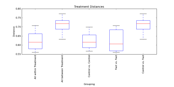
The first and second boxplots represent all within distances and all between distances, respectively. The first boxplot contains the distances within Control samples and the distances within Fast samples. Likewise, the second boxplot contains the distances between Control and Fast samples. The next two boxplots represent the individual within distances and the final boxplot represents the individual between distances. Since there are only two possible states for the Treatment field (i.e. Control or Fast), the all between boxplot is the same as the individual between boxplot. If there were more possible field states, however, the all between boxplot may not always match the individual between boxplots because there will be more than one individual between boxplot contributing to the all between boxplot.
Next, open up the file Treatment_Stats.txt in the tutorial_output directory:
Note
This file is most easily viewed in a spreadsheet program such as Microsoft Excel. It contains the results of multiple Student’s two-sample t-tests, comparing every pair of boxplots to determine if they are significantly different from each other. Note the ‘N/A’ cells in the file for the nonparametric p-values. By default, only the parametric p-values (from using the t-distribution) are reported (mainly because doing multiple permutation tests can take a long time on large datasets). To also compute the nonparametric p-values using Monte Carlo permutations, run the following command, which specifies 999 permutations:
make_distance_boxplots.py -m Fasting_Map.txt -d bdiv_even146/unweighted_unifrac_dm.txt -f Treatment -o tutorial_output -n 999
Open up the resulting file Treatment_Stats.txt:
Note
We now see the nonparametric p-values in addition to the parametric ones. If we look at the first comparison that was made (between ‘all within’ and ‘all between’ distances), the t-test indicates that the two distributions of distances are significantly different because of the extremely small p-values (even after the very conservative Bonferroni correction). Thus, the boxplots and significance tests seem to indicate that samples within the same Treatment field state (i.e. Control or Fast) are significantly more similar to each other than samples across, or between, field states (i.e. Control vs. Fast samples). In other words, Control samples are more similar to other Control samples, and Fast samples are more similar to other Fast samples than Control samples are to Fast samples.
To save the data used in the plots in a text file format, specify the –save_raw_data option:
make_distance_boxplots.py -m Fasting_Map.txt -d bdiv_even146/unweighted_unifrac_dm.txt -f Treatment -o tutorial_output --save_raw_data
This will generate the file Treatment_Distances.txt in the tutorial_output directory, which contains the raw data used in the plots in a tab-separated file format. This file can then be imported into other programs, such as Excel, for easy viewing.
To create plots for multiple fields in the metadata mapping file, you can specify a list of fields using the same -f option that we used before to specify the Treatment field:
make_distance_boxplots.py -m Fasting_Map.txt -d bdiv_even146/unweighted_unifrac_dm.txt -f "Treatment,DOB" -o tutorial_output -g png
This command will create another plot for the DOB field, as well as a plot for the Treatment field. The plot for the DOB field is named DOB_Distances.png. Notice that the image is in PNG format because we specified the output format with the -g option.
The make_distance_comparison_plots.py script can create plots that compare one or more field states within a metadata mapping file field to every other state within that field. Virtually any field found in the metadata mapping file can be used with this script. For the purposes of this tutorial, a timeseries field will be used as an example of the types of plots that can be generated with this script.
The make_distance_comparison_plots.py script will be used to create plots that compare one or more timepoints to each of the other timepoints in the time series field. The data used in the QIIME tutorial are not very useful for this type of plotting because there isn’t a time series field in the metadata mapping file. For the purposes of this tutorial, we will use the dataset from a study that transplanted samples from one part of the body to another (Costello et al., 2009). Please refer to the Input Files section for instructions on how to obtain this dataset. Samples were taken 0, 2, 4, and 8 hours after the transplant. This information can be encoded in a time series field in the metadata mapping file:
Note
Please note that this mapping file is greatly simplified from the one used in the actual study, but the relevant fields have been preserved for the purposes of this tutorial. It is also important to note that the TIME_SINCE_TRANSPLANT field was added to the original metadata mapping file used in the study. The time since transplant values were originally encoded in the fourth position of the SampleID, and were extracted out into their own field.
The time series field in this example is TIME_SINCE_TRANSPLANT. The Native field value indicates that the body site has not yet received a transplanted sample (time 0) and the Input field value indicates that the sample is a transplant sample. The numeric values indicate the hours since the transplant occurred. TRANSPLANT_TYPE indicates what body site the transplant came from, and as Native samples do not have transplants yet, their field value is none.
In order to visualize the differences between body site communities with transplants over time, we can run the following command to generate a barchart that compares each timepoint to the native (time 0) and input (transplant) samples. The resulting plot is a recreation of the first plot found in Figure 3 of the Costello et al. study.
make_distance_comparison_plots.py -m costello_timeseries_map.txt -d forearm_only_unweighted_unifrac_dm.txt -f TIME_SINCE_TRANSPLANT -c 'Native,Input' -o tutorial_output --x_tick_labels_orientation horizontal
This command will generate the file TIME_SINCE_TRANSPLANT_Timepoint_Distances.pdf in the tutorial_output directory. Open up TIME_SINCE_TRANSPLANT_Timepoint_Distances.pdf to see the resulting plot:
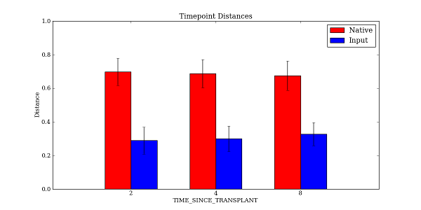
The mapping file is provided as input, as well as the distance matrix. For this example, the distance matrix was filtered beforehand with filter_distance_matrix.py to only include samples taken at the forearm site with tongue samples used as transplants. The resulting plot has two bars at each point in time: one for comparing distances between the timepoint and native samples, and one for comparing distances between the timepoint and the input (transplanted) samples.
The -f option specified the time series field, and the -c option specified what field values we wanted to compare to each of the other timepoints. In this example, we specified Native and Input as the two field states that we wanted each timepoint to be compared to in the resulting plot. We could just as easily have specified only Native, or Native, Input, and 2. Note that we specified the –x_tick_labels_orientation to be horizontal instead of the default (vertical) because the x-axis tick labels are very short and it looks better if they are rendered horizontally instead of vertically.
The spacing between each of our timepoints is not always uniform. In our example, the timepoints are at 2 hours, 4 hours, and 8 hours (notice the extra gap in time between T4 and T8). We can specify that the timepoints should be treated as numbers instead of categorical data. This will make the x-axis spacing between each of the timepoints in the resulting plot match the actual spacing between the numeric timepoints. The following command illustrates how to enable this functionality using the -a option:
make_distance_comparison_plots.py -m costello_timeseries_map.txt -d forearm_only_unweighted_unifrac_dm.txt -f TIME_SINCE_TRANSPLANT -c 'Native,Input' -o tutorial_output --x_tick_labels_orientation horizontal -a numeric
Open up TIME_SINCE_TRANSPLANT_Timepoint_Distances.pdf to see the resulting plot:
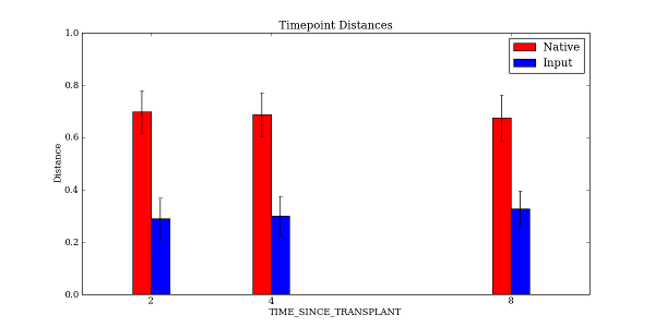
Notice that there is extra spacing between 4 hours and 8 hours, whereas in the previous example the spacing was even between each of the timepoints.
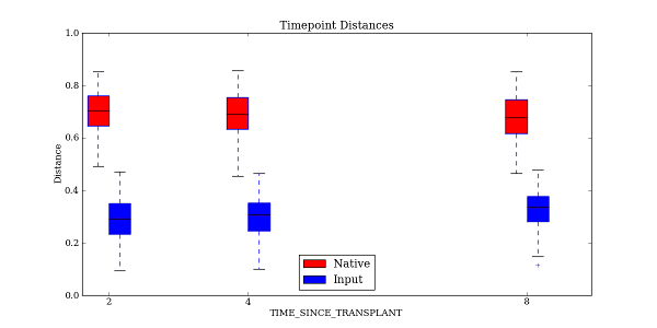
make_distance_comparison_plots.py also supports two other types of plots: scatter plots and boxplots. It is easy to choose which type of plot is generated:
make_distance_comparison_plots.py -m costello_timeseries_map.txt -d forearm_only_unweighted_unifrac_dm.txt -f TIME_SINCE_TRANSPLANT -c 'Native,Input' -o tutorial_output --x_tick_labels_orientation horizontal -a numeric -t box
The -t option generates a boxplot of the same data that was previously plotted as a bar chart:
The output file format can be specified in a similar fashion to that found earlier in the tutorial when we worked with make_distance_boxplots.py. As before, the raw data used in the plots can also be saved using the –save_raw_data option. The same type of statistical tests are performed as with make_distance_boxplots.py, where each pair of distributions is compared using Student’s two-sample t-test, with optional Monte Carlo permutations.
Costello, E. K., Lauber, C. L., Hamady, M., Fierer, N., Gordon, J. I., Knight, R. K. (2009). Bacterial Community Variation in Human Body Habitats Across Space and Time. Science, 326(5960), 1694-1697.